
INTRO
Most running brands go one of two ways cold and technical, or soft and lifestyle. VANTA Athletics was built to sit in the space between. A premium performance running brand for urban athletes who care as much about design as they do about distance.
This concept project covers the complete visual identity from initial mark development through to apparel applications, brand guidelines and social campaign assets. Every decision was made with one brief in mind: performance without excess.
THE CHALLENGE
Brief: Create a modern, premium and scalable brand identity for a UK running brand preparing to launch performance apparel, accessories and a members-based run club.
The identity needed to feel credible next to established names like On Running, District Vision and Satisfy but with its own distinct personality. Performance-driven. Clean. Slightly experimental. Built for a design-conscious audience aged 24–40.
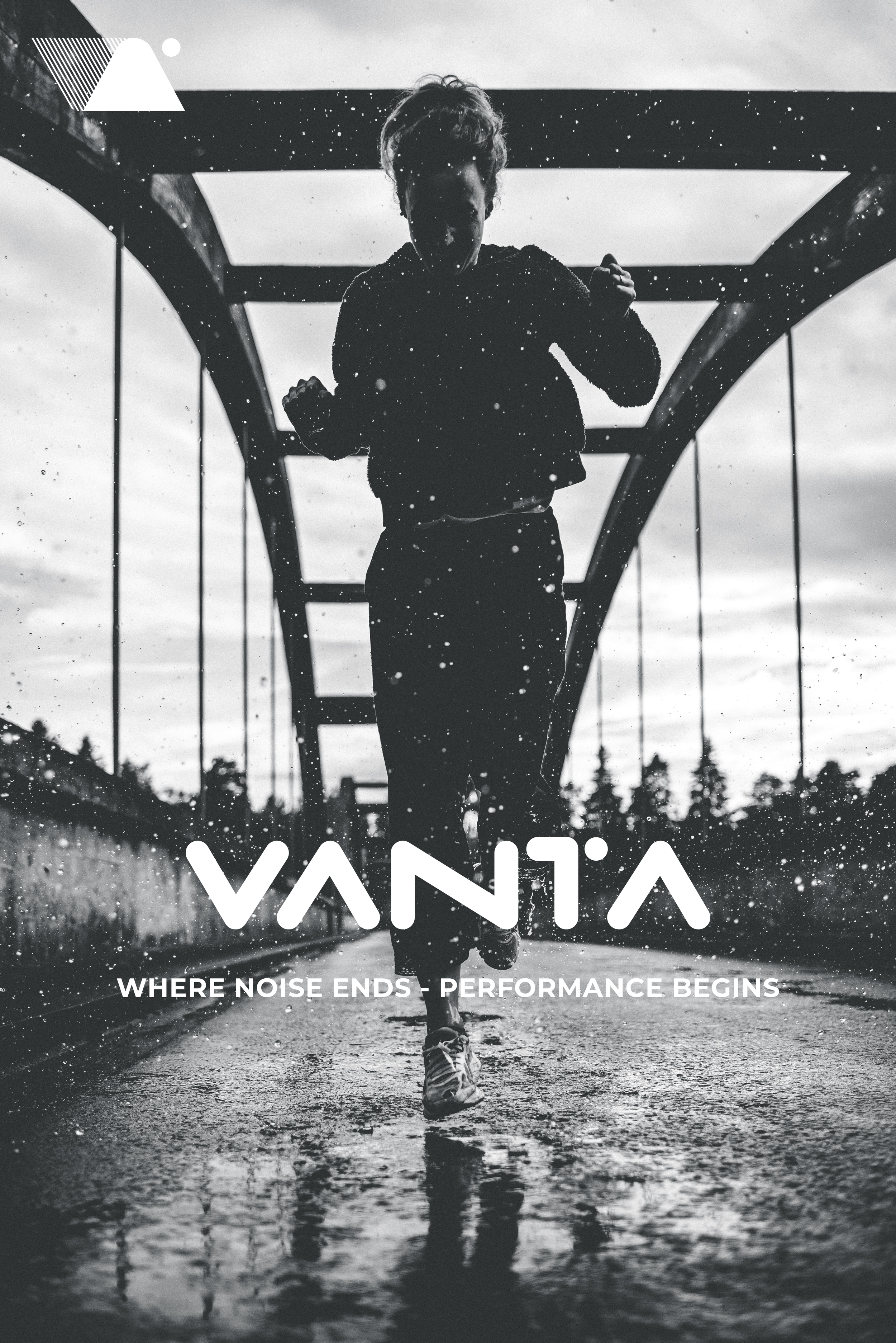
WHERE NOISE ENDS PERFORMANCE BEGINS.
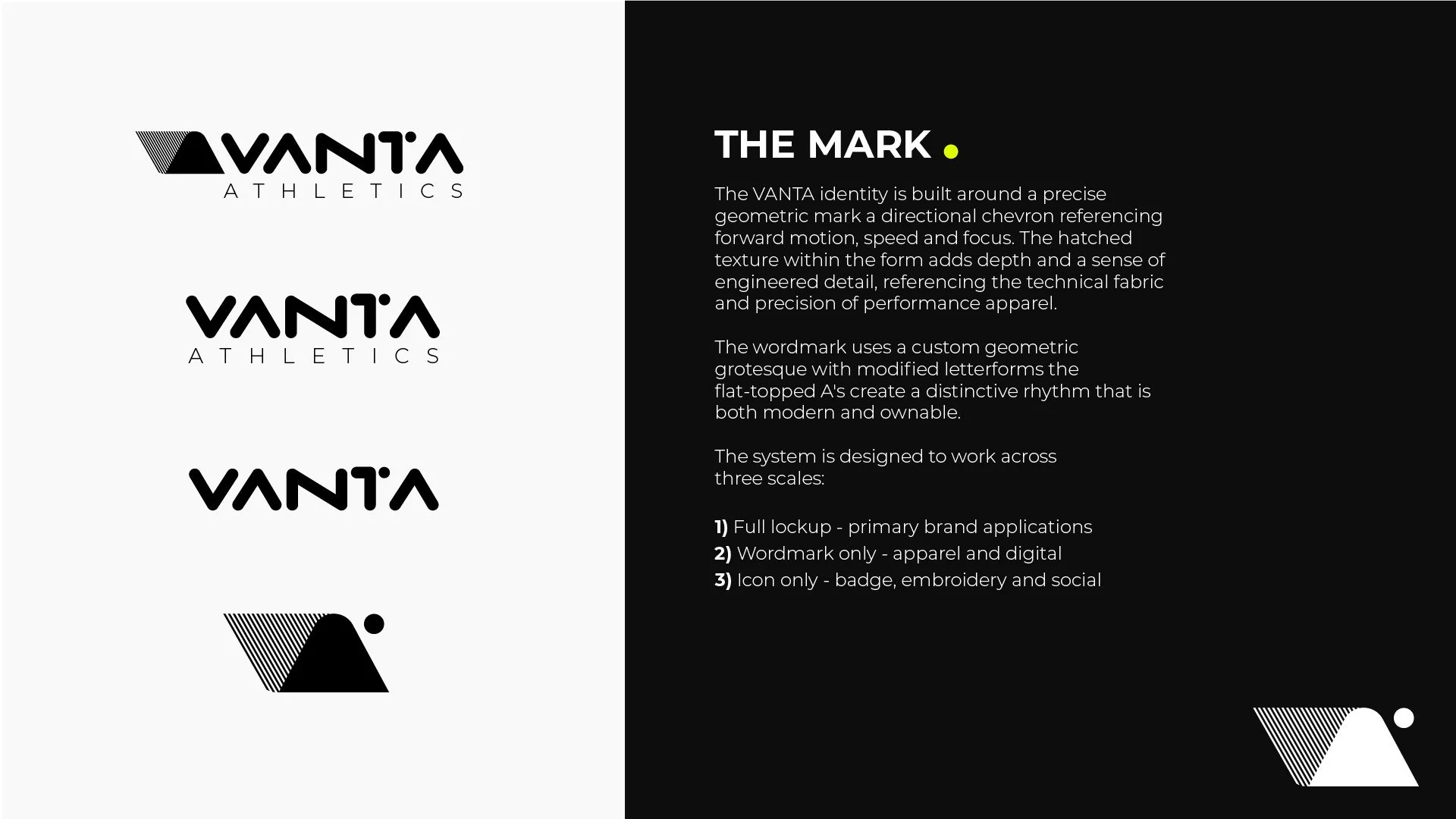
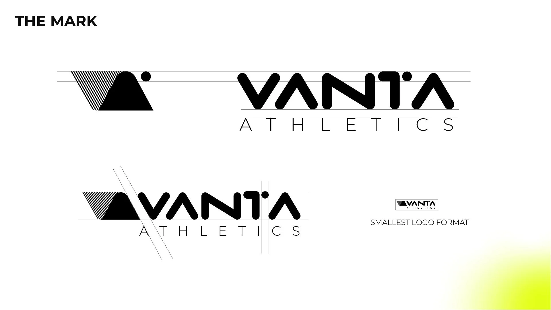
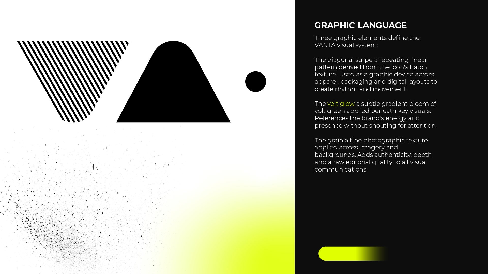
THE MARK.
The mark is built around a directional chevron precise, geometric, forward-moving. The hatched texture within the form references engineered performance fabric and adds depth without decoration. The wordmark uses a custom geometric grotesque with modified flat-topped A's, creating a rhythm that is both modern and ownable.
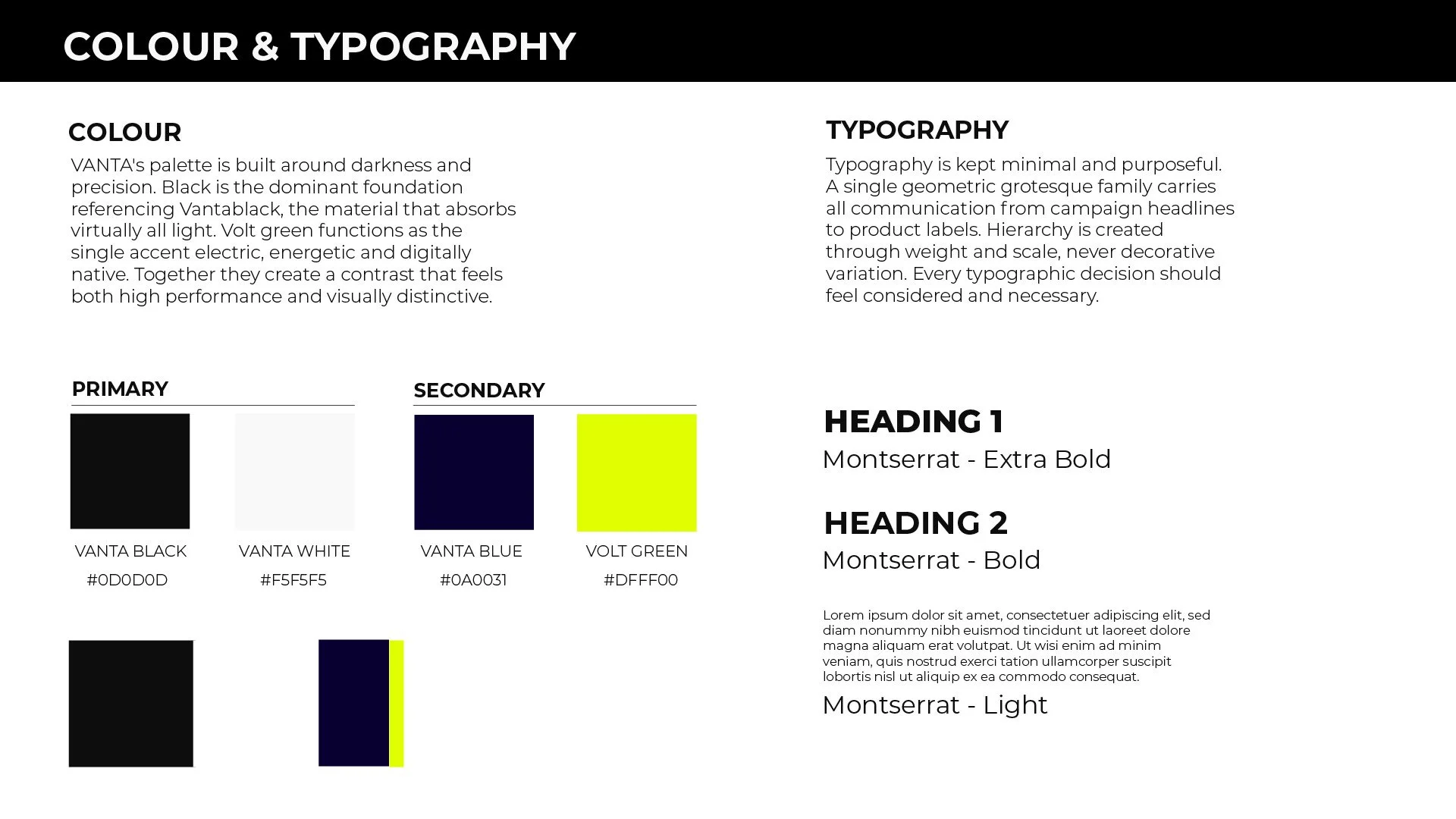
The name VANTA references Vantablack the material that absorbs virtually all light. The palette follows that logic. Black dominates. Volt green punctuates. Nothing else competes.

IDENTITY
"A brand built for the quiet ones who move the fastest."
Concept project — 2026 Photography: Unsplash — used for concept purposes only
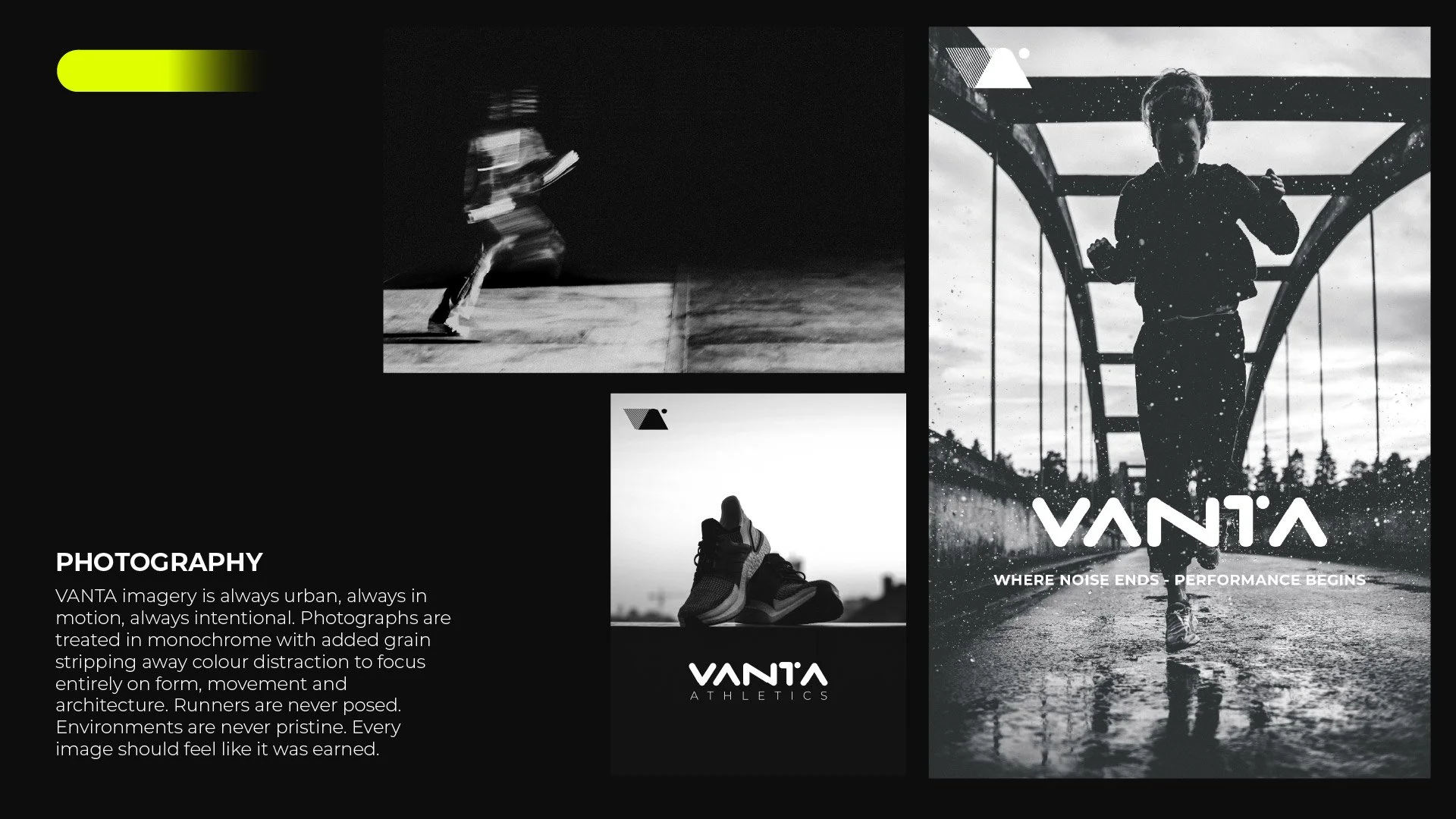
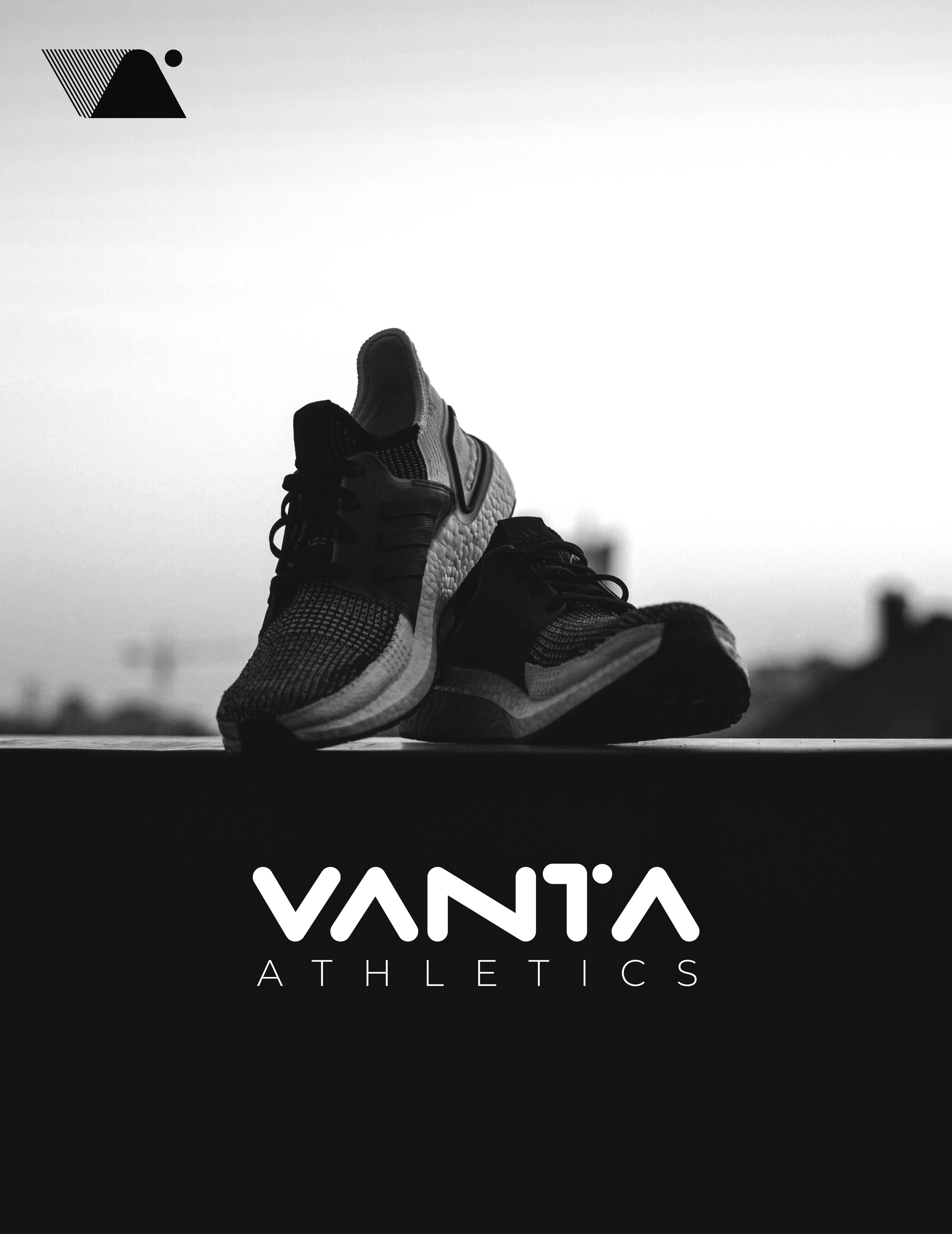
The identity was applied across performance apparel running cap, technical jacket and polo as well as social media templates, campaign photography and brand guidelines. Each application strips back to essentials. The right mark. The right place. The right scale. Nothing more.